
HacktoberfestUp-For-Grabs
仓库指标
- 星标
- (5,134 个星标)
- PR 合并指标
- (30 天内没有已合并 PR)
描述
Description
Hi,
I find the current git icon not so fitting in with the rest of the icons (since it is simple the word "git"). It is probably not so helpful when going through files and folders to find something like this (especially the "git .git" combo)
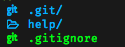
I would propose to use the alternative git icons instead: I will shortly post a pull request for it.
- Relevant Issues : (none)
- Relevant PRs : (none)
- Type of issue :
- Installation
- Font-related
- Feature request
- Bug in existing feature
- Developer mode : Code quality / Tests / Documentation