倉庫指標
- 星標
- (389 顆星)
- PR 合併指標
- (PR 指標待抓取)
描述
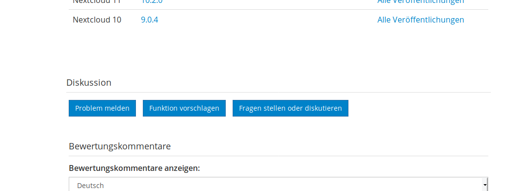
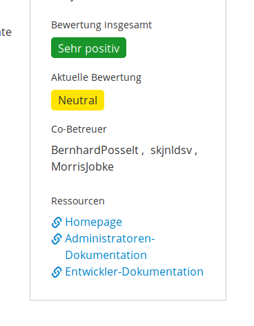
Hi, we would like to point out an UI inconsistency of the app store: there is two different spots on where to find information on the repository, admin links, manual etc.
Detailed description On the "page" of each app in the app store, you may find the link to the repository either on the right hand side in the summary box or, far down below, just before the comments/review section starts. So one always has to look on two different areas for more or less the similar kind of information. In addition to that it seems that in the summary box the provided links are quite different from app to app... Some link to the repo, some to the wiki pages, some to a Nextcloud website page, and so forth...
Solution approach
-
Our proposal would be to drag the buttons from down low (the ones with blue background) upwards to or close to the summary box.
-
Define a clear set of rules for the joint approach, e.g.: 1) homepage, 2) repository, 3) issues, 4) user manual or wiki, 5) admin manual or wiki 6) developer manual or wiki 7) discussion & questions