P2Type: feature requesthelp wanted
Repository metrics
- Stars
- (20,263 stars)
- PR merge metrics
- (PR metrics pending)
Description
Feature request
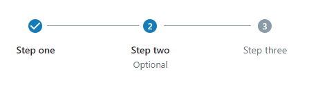
A new stepper component, as seen in some other UI libraries. Material UI has a decent design, in my opinion, which fits into Blueprint's design philosophies quite well, although they break down sub-components too far.
There are three basic components that I think would make for a good API:
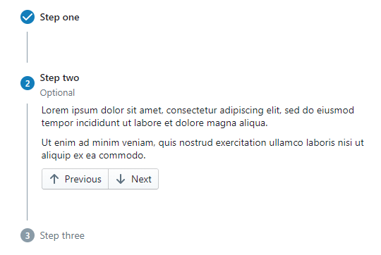
Stepper- A wrapper component that controls the steps within. The best comparison I can make is howTabsrelates toTab. Most of the configuration would reside on theStepper.Step- A single step. It consists of a label, but could also contain content and/or an icon. A step could have a combination of various states, such as active, errored, or completed, which would change its appearance.StepConnector- Between steps are connectors. By default, this could just be a line, but having the component and allowing a custom connector to be attached to theStepperwould benefit those wishing to customize the look or appearance between steps.
API
IStepperProps
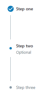
activeStep- A controlled value indicating which step is active.vertical- A stepper could be either horizontal or vertical.alternativeLabel- The label of a step may appear below its icon, rather than to the right of the icon.fill=true- A stepper might fill its container, via the step connectors growing in length equally.fill="accordion"- Like fill, except only the connector before the active step grows in length.
large- The steps may have a large appearance.linear- Some steps are completed in order, but not always. When linear istrue, theactiveStepwould automate the stepscompletedstate. Setting this to false would allow users to control which steps are completed themselves at the step level.
IStepProps
label- A step needs a label.labelInfo- A step might have an "additional label" with a muted appearance that appears below the normal label.icon- The name of an icon or the content to display within the icon circle. Allows content so users can specify things like numbers or letters if desired. If no icon is specified, then a dot will display instead.error- Indicates that the step is in an error state, which forces the icon to display an "error" icon.completed- Normally set automatically from the parent stepper, but can be forced true or false instead.active- Normally set automatically from the parent stepper, but can be forced true or false instead.
IStepConnectorProps
error- Indicates that the next step is in an error state, which forces the icon to display an "error" icon.completed- Normally set automatically from the parent stepper, but can be forced true or false instead.active- Normally set automatically from the parent stepper, but can be forced true or false instead.
Code examples:
Simple example:
<Stepper activeStep={activeStep}>
    <Step label="Step one" />
    <Step label="Step two" error={true} />
    <Step label="Step three" />
</Stepper>
Example with content:
<Stepper activeStep={activeStep} vertical>
    <Step label="Step one">This is step one</Step>
    <Step label="Step two">And two</Step>
    <Step label="Step three">Almost done!</Step>
</Stepper>
I have a working demo for those who like the idea: https://github.com/justinbhopper/blueprint/tree/stepper
Demo
Example demo: https://i.imgur.com/16Q35RY.gifv