
Repository metrics
- Stars
- (728 stars)
- PR merge metrics
- (30d に merged PR はありません)
説明
plot has to make assumptions about the data, I think the categorical plot could be improved to help with low-frequency category cases. The following plots come from the autompg dataset. The cylinder column has 2 low-frequency categories (3 & 5) and 3 high-frequency categories. Notebook:
https://github.com/ianozsvald/dabl_experiments/blob/master/autompg_example.ipynb
Dabl plot shows 5 categories, out of sequence, all categories appear to be 'good':
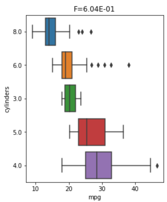
The above plot seems to use median-sorted display order, it makes it look as though there's a sequence in the data which isn't true [8, 6, 3, 5, 4] for cylinders.
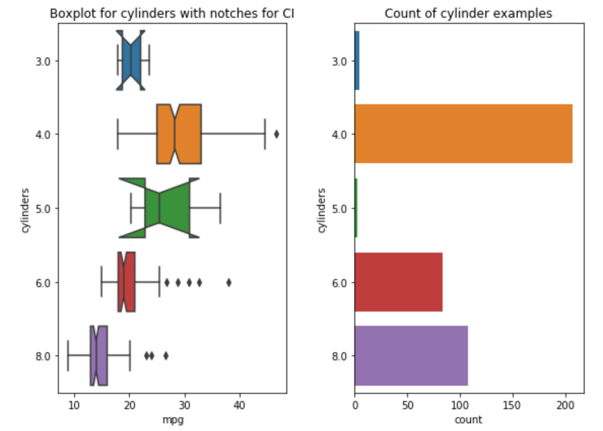
Adding a countplot shows low-frequency for 2 categories and adding notch=True shows very wide confidence intervals around the median for these - this looks ugly for those unfamiliar with CIs but is informative if you know it means 'wide CI, probably caused by few datapoints':
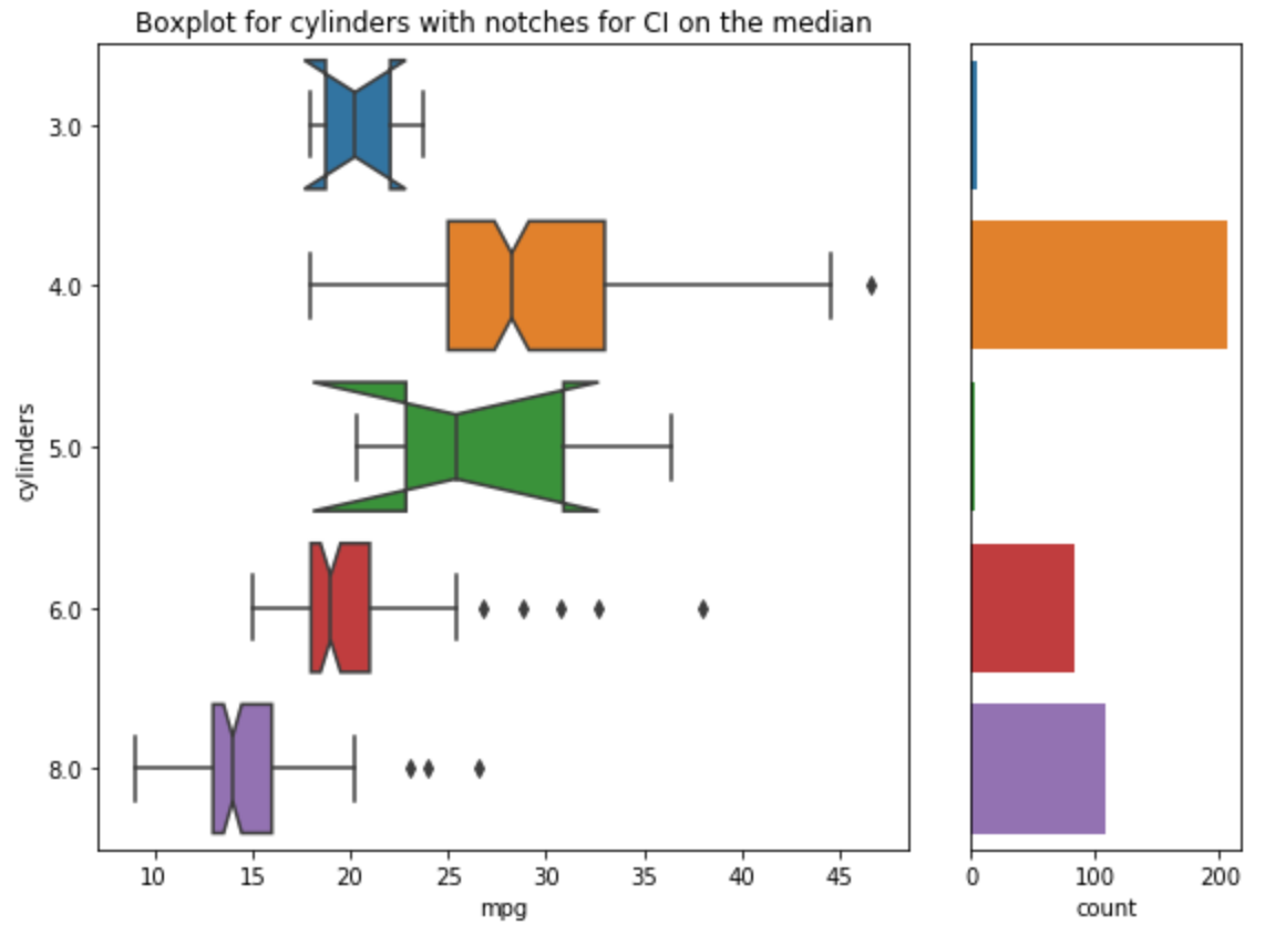
A neater plot would make the countplot a smaller part of the overall plot but it still takes up a lot of space:
Adding frequency counts into the y-axis labels might be a useful way to summarise this:
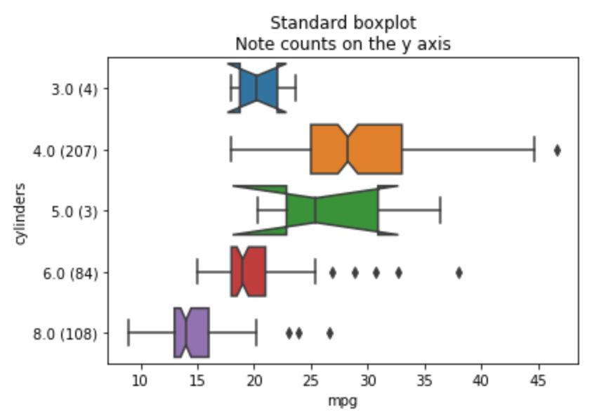
The y-axis label could say something coarser like "<10", "<1k", "<10", "<100", "<1k" or somesuch to avoid too much detail.
I guess one question is - what's the purpose of dabl for EDA? Is it to give fine-grained results that have been automatically interpreted to tell a story? Is it to give the user a steer towards interesting relationships which they should examine in further depth? I think that notches and countplots and default sorting decisions will always be righter or wronger for different cases.