status-im/snt-voting
Create responsive design for mobile vs desktop
Ouverte
#28 ouverte le 29 oct. 2018
Voting flowhelp wanted
Métriques du dépôt
- Stars
- (10 étoiles)
- Métriques de merge PR
- (Métriques PR en attente)
Description
Description
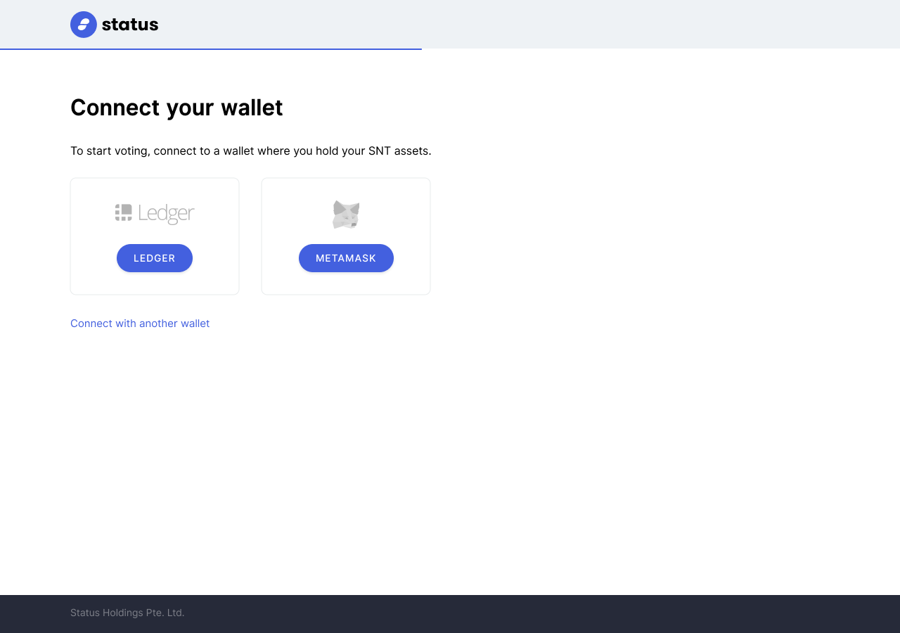
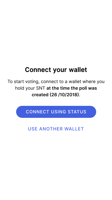
We need to implement responsive. Current implementation enlarges the elements from mobile to desktop. This presents a couple of issues:
- Mobile design not intended for desktop (everything is stretched)
- Poor UX since we cannot recognize yet if the user is on mobile/desktop. By identifying the user's device, we can improve the experience. E.g. Focus the experience on MM or Ledger if the user is on desktop.
Example:
Mobile
Desktop