UI - Remove drop shadow on pass/fail Health dots
Nobody has claimed this yet.
Assessment
- Difficulty
- 2/5
- Estimated time
- 1-3 hours
- Newbie friendliness
- 65/100
- Issue type
- Bug
- Clarity
- Clearly specified
- Activity status
- Stale
- Tech stack
- typescript
Research direction
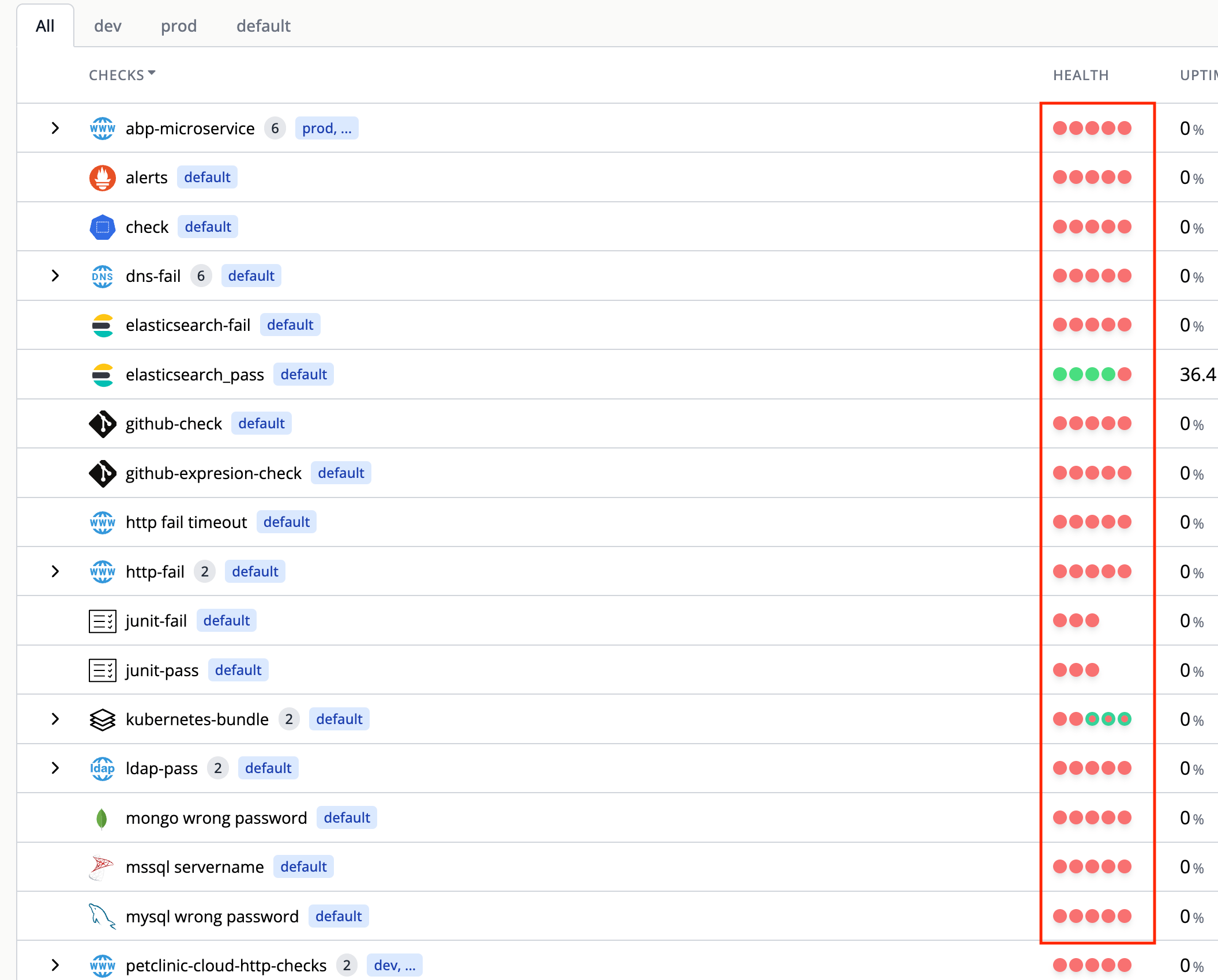
Start by locating the Health Screen implementation and the Health column's red and green dots, using the attached screenshot as the visual reference. Remove the drop shadows from those dots and verify that they are clearly distinguishable against the white background.
Written by the indexing model from the issue text.
Description
On the Health Screen, the red and green dots in the "Health" column should not have drop shadows as this makes them harder to read. Removing the drop-shadows will increase the contrast and make them more distinguishable on the white background.
- Dominant language
- TypeScript
- Stars
- 12
- Forks
- 25
- Avg merge
- 5h 46m
- Merged PRs (30d)
- 12
Contributor guide
No contributing guide indexed for this repository
First steps
- Read the whole issue, then the project's contributing guide.
- Comment on the issue to say you are picking it up — it saves two people doing the same work.
- Fork the repository and make your change on a branch.
- Open a pull request that references the issue number.
More from flanksource/flanksource-ui
-
Difficulty 2/5 1-3 hours Newbie friendliness 62/100
flanksource/flanksource-ui#3049 ·
-
Difficulty 2/5 1-3 hours Newbie friendliness 76/100
flanksource/flanksource-ui#3017 ·
-
Difficulty 3/5 1-2 days Newbie friendliness 45/100
flanksource/flanksource-ui#3055 ·
-
Difficulty 3/5 1-2 days Newbie friendliness 45/100
flanksource/flanksource-ui#3050 ·
-
flanksource/flanksource-ui#3025 · 1 assignee ·
All issues in flanksource/flanksource-ui
Similar issues
-
calcite-components needs triage refactor
Difficulty 2/5 1-3 hours Newbie friendliness 75/100
Esri/calcite-design-system#15203 ·
-
Difficulty 2/5 1-3 hours Newbie friendliness 91/100
-
community first-timers-only good first issue hacktoberfest help wanted low hanging fruit up-for-grabs
Difficulty 1/5 Under an hour Newbie friendliness 95/100
-
Difficulty 2/5 1-3 hours Newbie friendliness 78/100
Automattic/studio#4908 ·
-
Difficulty 2/5 1-3 hours Newbie friendliness 90/100